Case study:
Creating a better furnishing shopping experience.
Ashley Furniture (formerly known as Ashley HomeStore), is an American Furniture store chain that sells high-quality and fine furnishing home products. Opened in 1997, the chain compromises 2000 locations worldwide. The chain has both corporate and independently licensed and operated furniture stores.
How can we make our users happier when they are shopping online? The old look and feel and experience is difficult, was not that good and was difficult to find items, do payments, follow up on tracking shipments and such. It all started with an idea of making a better shopping app to sell furniture online, but needed to dive deep into how to go about it, what common problems are? How can we stand out in the competition? So took this concept and developed it using a user-centered design process model.
Let’s first look at what this project is all about. Buying furniture for your home or office is a tedious job. Visiting every store to find that perfect furniture is also time-consuming. Looking at the current situation, it is even more, tough to visit every store and sellers are having a tough time finding customers.
Buying furniture online is even more important now and can solve most of these problems. Customers can easily browse through various catalogs for furniture & home furnishings and use easy payment options to buy online. Some users who like to visit the store, can save their favorite products in-app and use the app to locate a store where they can personally examine that product where it is available.
Project Details
Role/Contribution: UX Strategist, Product Designer
Cross-Functional Team (Co-Shore): Product Designer, UI Support
Industry: E-commerce, furniture, home appliances
Project Timeline: 30 Weeks

Research and Analysis.
Using various survey findings and user interviews I was able to narrow down some common problems faced by customers while buying furniture online or increase app interactivity in many ways. Some of the points were:
Sellers don’t use real product images and they look like stock photos.
Also, the quality of the images was low, hiding important details.
They don’t buy products without going through reviews as products are expensive, adding to the risk factor. During competitor analysis, we found many furniture stores were missing this important feature.
Some users who are used to buying furniture in-store are hesitant to buy online as they like to physically check those products.
Catalog with thousands of products makes it confusing to find what they need and overwhelming.
The Challenge
The challenge was to come up with an online furniture store app that is not confusing for users to explore and helped achieve user goals with ease. Users should be able to find their product fast and easy with quick check-out options. The product page should have features which help to build trust among frequent & new buyers so that they don’t feel hesitant and feel safe to order furniture online
If a user still wants to do in-store shopping we need to find out how our app can be useful to these users and help them in a way to find and physically examine products in-store.


Methodology & Vision.
Business Goals
The goal is to find common problems and frustrations faced by a user while buying furniture online and improve user experience. The app should help users to buy products whether online or in-store. They should be able to meet their goals from finding products to checkout with ease.


Also, tried to understand what technology we are targeting and how our app will be useful to our users based on technology, and how we can interconnect all the functions. It is important to look at all the constraints and cross-platform options we can think of and later add or develop it with more research.
In addition, it is important to identify who your target audiences are and what tasks they will complete. Worked on identifying these audiences (avoided being broad) to perform further analysis like user research, personas, empathy map, etc. Addressing their needs and frustrations compared with market research & stakeholders and tasks they will perform.

Things to consider!

Did some market research to know the shopping behavior of users using various shopping apps and their preference for online shopping. Also, to know if customers prefer shopping online or in-store and how can we increase engagement via our app.
Based on this market research, I was able to analyze and write down some key points to help us improve the user experience. These points are as follows:
Maximum users buy something online using their cellphones, especially Americans under the age of 50.
Maximum shoppers prefer online shopping than physical stores without comparing prices.
Online reviews are important to build trust before buying a product.
Focus on easy online transactions.
Ease of use and should be appealing to younger generations and sharable content for social media.
Compare prices & ratings from different sellers.
Asking questions for the product to build trust, especially new shoppers.
Competitor Analysis
Competitor analysis is a way to collect and compare data about products (and companies) in the market place. This method is often used to highlight the strengths and weaknesses of products to make more informed decisions about your product strategy.
It is important to know who your direct and indirect competitors are. For our online furniture store project, using feedback from users and online research I sorted these companies which can be analyzed as direct or indirect competitors. (See image for SWOT Analysis results).
Direct Competitor
Pepperfry
Ashley HomeStore
Urban Ladder
InDirect Competitor
Amazon
eBay
Shein

Market Research & Competitive Analysis.

I did various surveys and interview based on online shopping and buying furniture online, to know all the pain points and challenges the user is facing and opportunities for us to improve.
Based on this, I was able to collect quantitative & qualitative data to create user personas, empathy maps, and scenarios to know all the challenges users are facing to make an informed purchase decision.
The users who volunteered for the survey and interview are -
Users who shop online regularly.
Users have bought furniture online in the past or are active buyers for home furnishing.
Users who have never bought furniture online.
Users who know various shopping apps and online furniture apps.
Users who buy furniture in-store and don’t have much knowledge about buying furniture online.
Users who never bought furniture online but like to explore furniture online and interested in buying in the future.
Doing surveys helped me gather valuable quantitative data, to create statistics for various shopping behaviors.
If the users are regular online shoppers or never shopped online?
What all things they look for while shopping online?
What features do they use most?
Which feature do they find annoying?
Which feature helps them to build trust?
and more...
In personal interviews, I asked various questions which can help me know various challenges, pain points, and build an empathy map. Questions like:
What are your frustrations while using these apps?
How much do you like to use the search, sort/filter, etc features to narrow down products you need?
Which features are useful to built trust to buy these products?
Which features you wish the product page had, to build more trust while buying?
Which offer or discount you prefer most?
What are common frustrations during the checkout process?
Based on these data I was able to record some key findings:
Users find having too many ads annoying.
Users go straight to the search feature to find the product they need and use sorting/filter to narrow down the product list.
Users like to have reviews and seller Q&A to find if the product and seller are genuine and worth buying.
Users like to have a 1 on 1 offer or a good discount. They prefer to avoid products with no sales or discount offers.
Users like to have a fast checkout process with minimal steps.
Users would like to have a good return policy in place and free shipping.
and more…

User Interviews.
User Personas.
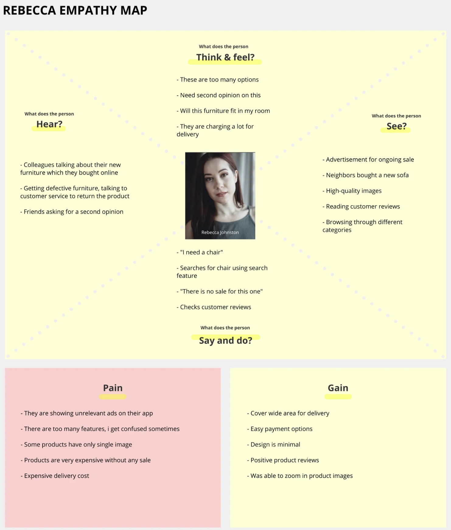
Based on the quantitative and qualitative data, I then started building personas. They represent the majority of potential users who will use our app to buy products. They help understand pain points and goals for the majority of users and build empathy maps & scenarios related to the app.
I created these user personas based on the data we have collected:
Rebecca Johnston
Patrick Hamilton
These personas include demographics, personality, short bio, daily activities, etc. They also include their goals and frustrations while using similar apps and their knowledge of using various devices and social media presence. All this data is crucial for building an app and to understand their journey.

These personas include demographics, personality, short bio, daily activities, etc. They also include their goals and frustrations while using similar apps and their knowledge of using various devices and social media presence. All this data is crucial for building an app and to understand their journey.
Empathy Map
To understand users further and in more detail, it is important to build an empathy map for your personas. An empathy map is a collaborative visualization used to articulate what we know about a particular type of user. It helps in understanding the user and aids in decision making. Empathy map helps us understand what users hear, think & feel, see, or say while achieving their goals. They also help us find crucial pain points and gains.

Workflow & Wireframes.
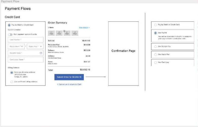
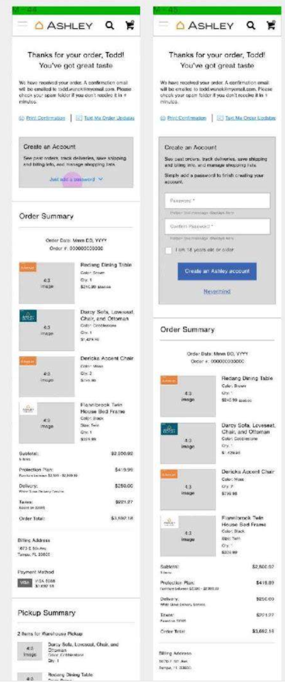
In the ideate phase, we can create a user flow using the user journey and other data. User flows, UX flows, or flowcharts are diagrams that display the complete path a user takes when using a product. With this, I was able to layout the user’s movement and mapping out each step a user will take from entry to final interaction. This is how my user flow looks like and below this example, you can find some raw wireframes for payment methods,Ashley product page, shipments, checkout, confirmation, among others, you can also check the comparison between mobile and web view of the same site.


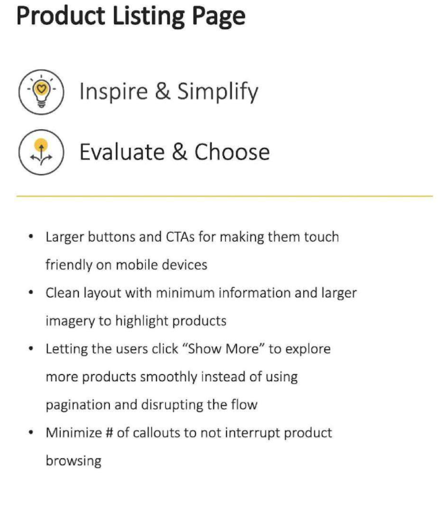
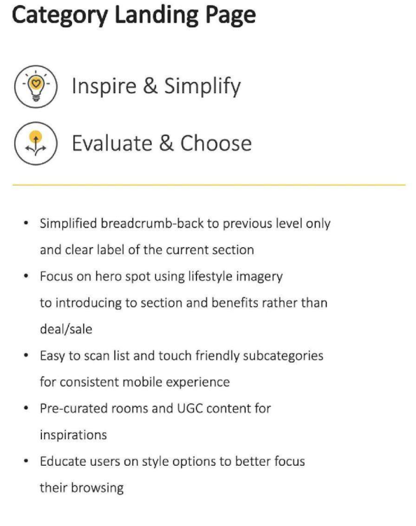
High-Fidelity Mockups and Final Visuals.
High fidelity prototypes or in this case, mockups, can also be used to perform usability testing to see if it allows users to reach their goals with ease and what problems they face while performing these tasks. So, based in our wireframes we crafted the final look and feel and visual style of Ashley. Here are some examples:


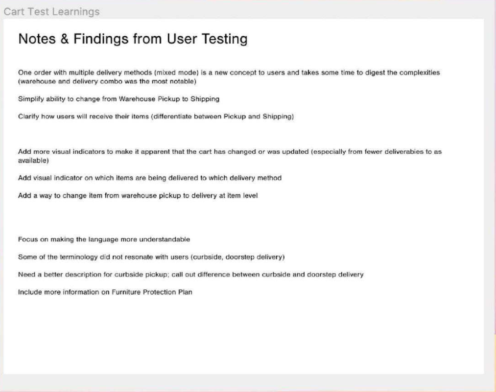
Usability Testing.
After conducting the Usability Testing rounds with different users, here were the preliminar results which were not entirely satisfactory as you could see, so there was the need of some design tweaks!
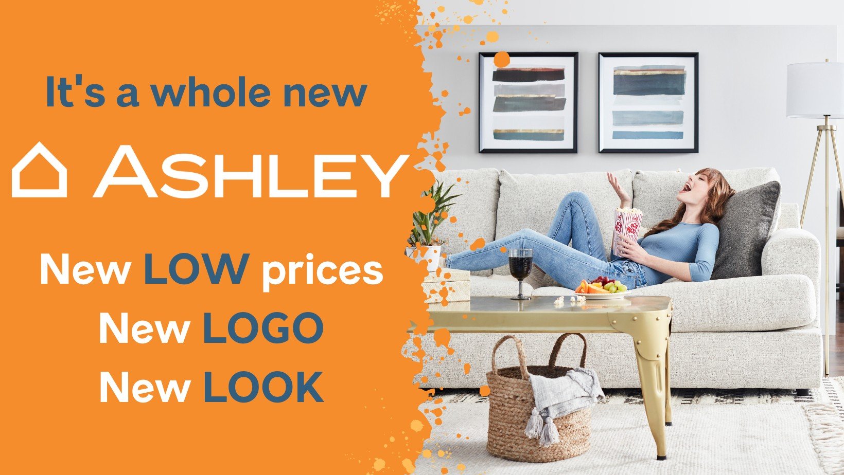
Ashley Furniture Today.
By doing research, testing and gathering valuable information I was able to go through the various aspect of the design phase. It was a huge learning process for me, learned a lot through various market research & competitive analysis about businesses and their best practices. Through user research, I was able to understand users even more, what they think? how they do things? what are their frustrations and gains? and going through a mission to make their life easier through a better user experience.
During the research, it is easy to get overwhelmed with information and overthink at some stages. Also, sometimes you try to mix your experiences and get biased opinions. But, over time I am able to avoid these things and stay on track and plan. This helped me to understand users better and think about their problems for the app more in-depth. Here I leave at the end some comparisons of how the site looked before versus the design vision and the justification for this new path and vision.


From the perspective of its UX and UI layout, Ashley’s online overall style is simple and clear. The website provides customers with a lot of discount information and limited coupons on the top. I think the good thing is that Ashley provides online chat, telephone and reservation services at the top middle of the website’s home page. Customers don’t have to browse to the bottom of the page to find out how to make an appointment and call.

