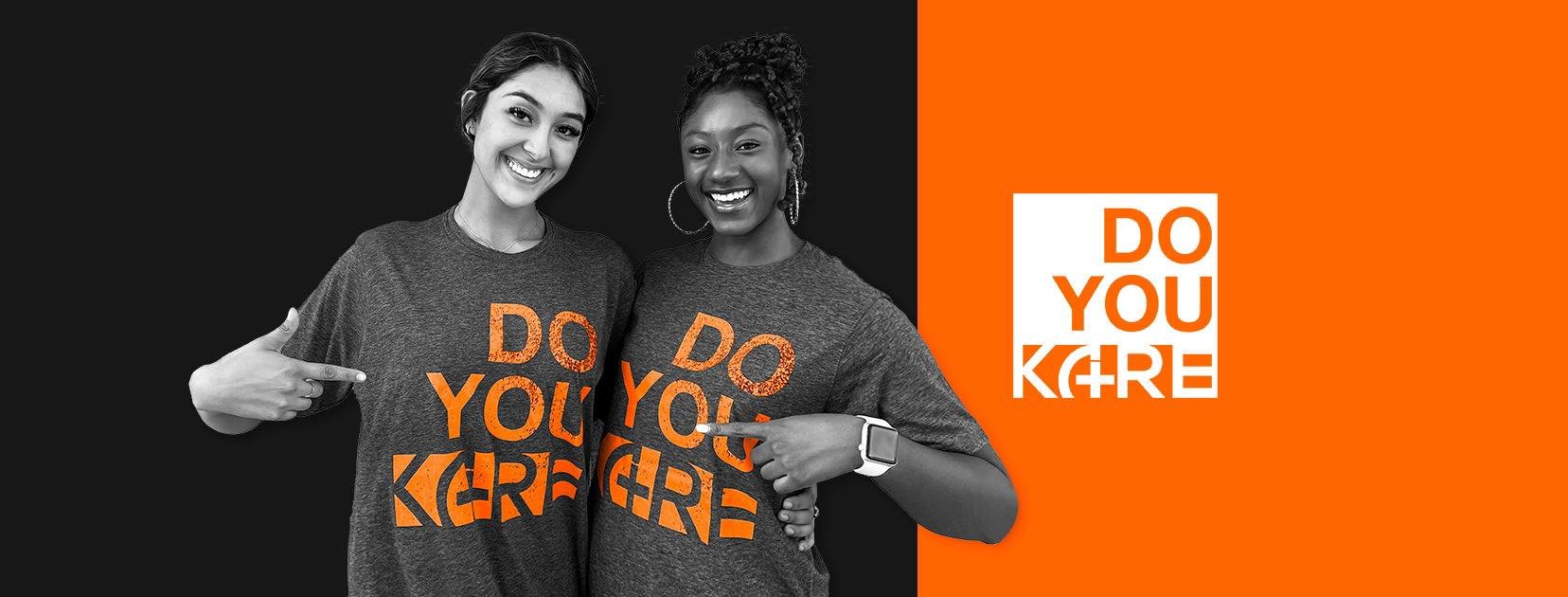

KARE Technologies. “We can be Heroes just for one day”.
KARE is an app that connects passionate CNAs, LVNs/LPNs, and RNs like you with Senior Care and Post-Acute Care communities. Designed to put you back in control of your career, with KARE:
You choose when and where you work.
Get paid for your shift with HERO Real-Time Pay™
Refer friends and get paid every time they work a shift…FOREVER
What is a KARE HERO?
KARE Heroes are the best-of-the-best. A KARE HERO is a someone who longs for more independence, who wants to care for seniors, and who WANTS TO SAVE THE DAY!
KARE is NOT a staffing agency. Think of us more like a matching service between you, a KARE HERO, and a caring community. You get to decide where you want to work, when you want to work, and how much you want to work, as there are no minimum shift requirements. Unlike an agency, the caring communities are responsible for setting the pay scale, not KARE. The KARE platform simply provides a way of matching the best communities with the best Heroes simply and efficiently.
The Advantages of Flexible Nursing Shifts
During the COVID-19 pandemic, nurses left the profession in record numbers, exacerbating the nursing shortage and its effects. Many nurses cited workload stress, lack of job flexibility, and the inability to offer hope to their sick patients.
But the nursing exodus hasn’t ended.
An April 2023 report by NCSBN revealed that approximately 900,0000 nurses plan to leave the profession by 2027. A state-by-state breakdown of the nursing shortage can help identify areas with the greatest need.
A lack of engagement and symptoms of burnout are key factors. The desire for flexibility has contributed to the rising number of nurses and healthcare workers who experience burnout. In response, several companies have created technology that offers flexible nursing shifts.
Nurses have turned to travel nursing and temporary staffing to seek flexibility. The move to flexible staffing apps helps address this need and potentially lowers the risk of burnout.
Improving work flexibility benefits both healthcare facilities and patients. By offering nurses flexible schedules that can help reduce burnout, hospitals may lower their reliance on travel nurses and the subsequent financial burden of paying premium wages.
Flexible hours can also act as a stopgap to keep more nurses in the workforce as states develop strategies to combat the nursing shortage.
What is the problem?
Seeing the bigger picture.
Usually it is very quick. As long as you have a healthcare license in good standing with the state, all we require is a brief interview, certain state mandated documents (healthcare license, ID, BLS card and maybe a few others), a very quick background check and drug screen, and we can have you applying for shifts very quickly. You choose when and where you work.
But there is a problem: there is no screen or message information about the application status in the app, let alone many users complained about the fact that they are uncertain about the status and also how to upload the required documentation by their laws of their state if there is NO categorization inside the app. They want guidance and status across the Onboarding application process overall and they are clearly unsatisfied with the “ugly” visuals of the app that makes their task even more overwhelming to find significant shifts, bonuses, promotions, etc.
The digitalization of the healthcare field is on the rise and increasing marginally day by day and many health care personnel find it either hard to understand the existing digital healthcare facilities, finding it hard to adapt, or do not have access to it. There is an urgent need for a sophisticated, realistic solution to confront this current challenge, in addition to the corona pandemic that swept the world recently.

Solutions, Ideation and Methodology.
First steps of our re-design process ideation.
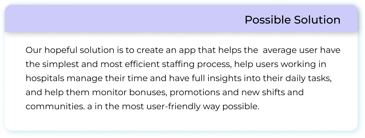
The redesign proposes the following solutions to address the identified problems:
Modern UI/UX: Update the app’s visual design to a contemporary, intuitive layout.
Streamlined Onboarding: Simplify the onboarding process by standardizing documentation requirements for each state and clearly distinguishing mandatory from optional documents.
Flexible Resume Submission: Allow users to fill in their resume online or upload an existing document.
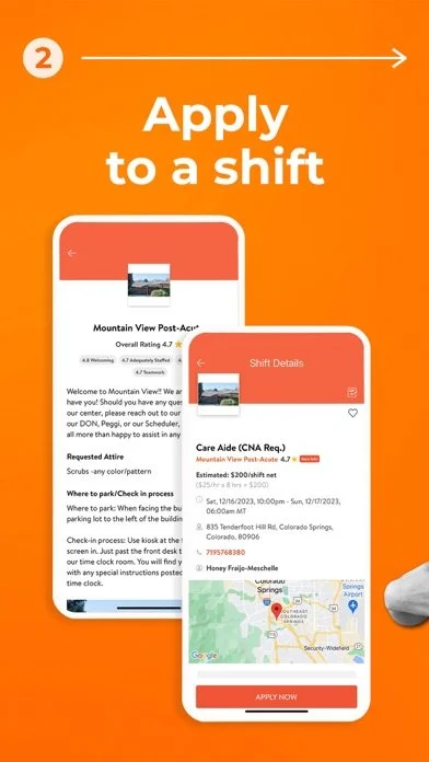
Simplified Shift Applications: Redesign the shift application process to be more user-friendly and intuitive.
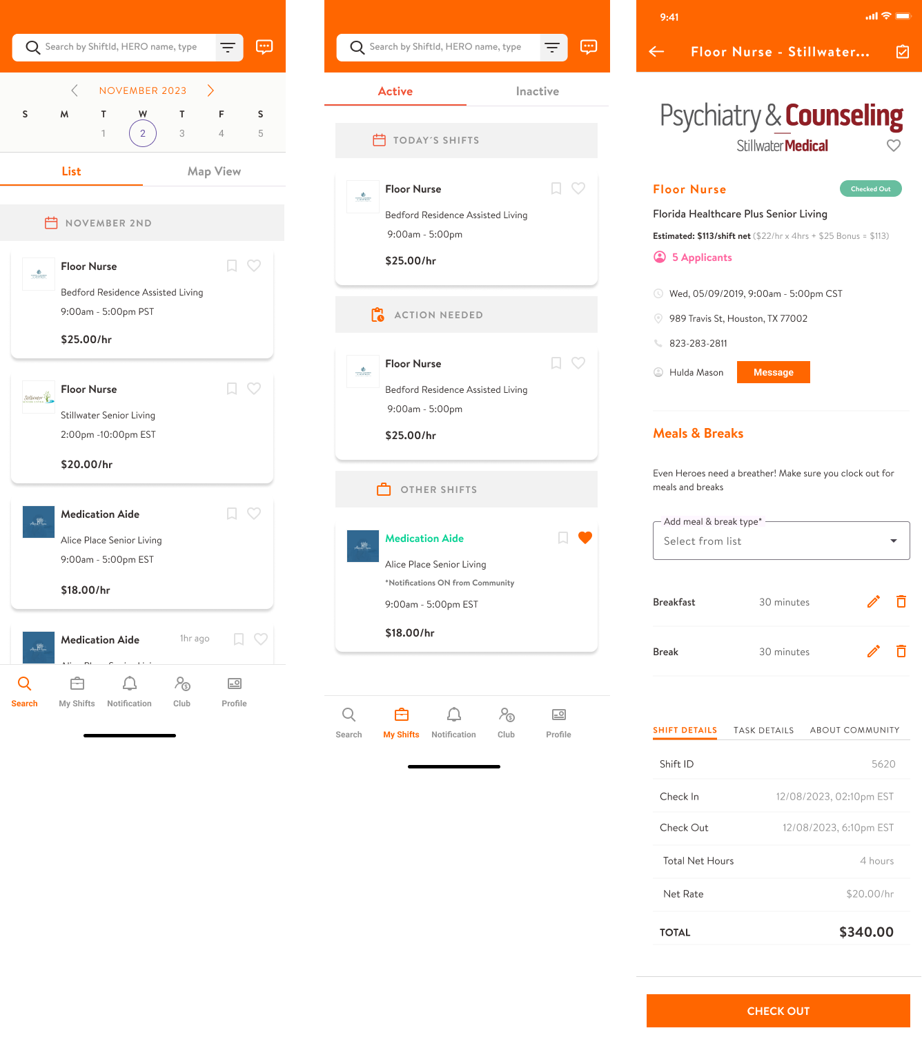
Detailed Community Info: Introduce tabs for shift details, task details, and community information, along with meal and break details.
Enhanced Checkout Process: Enable users to rate and review the community, save them as favorites, or block them.
Efficient Check-in: Implement a QR code check-in option alongside the traditional check-in process.
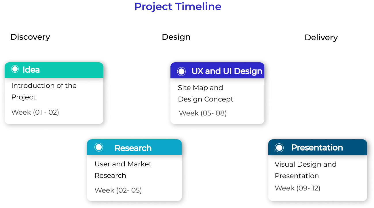
PROJECT DETAILS:
Role and scope: UX/UI Designer, Researcher + 1 visual designer + 10 members of the development team and PO.
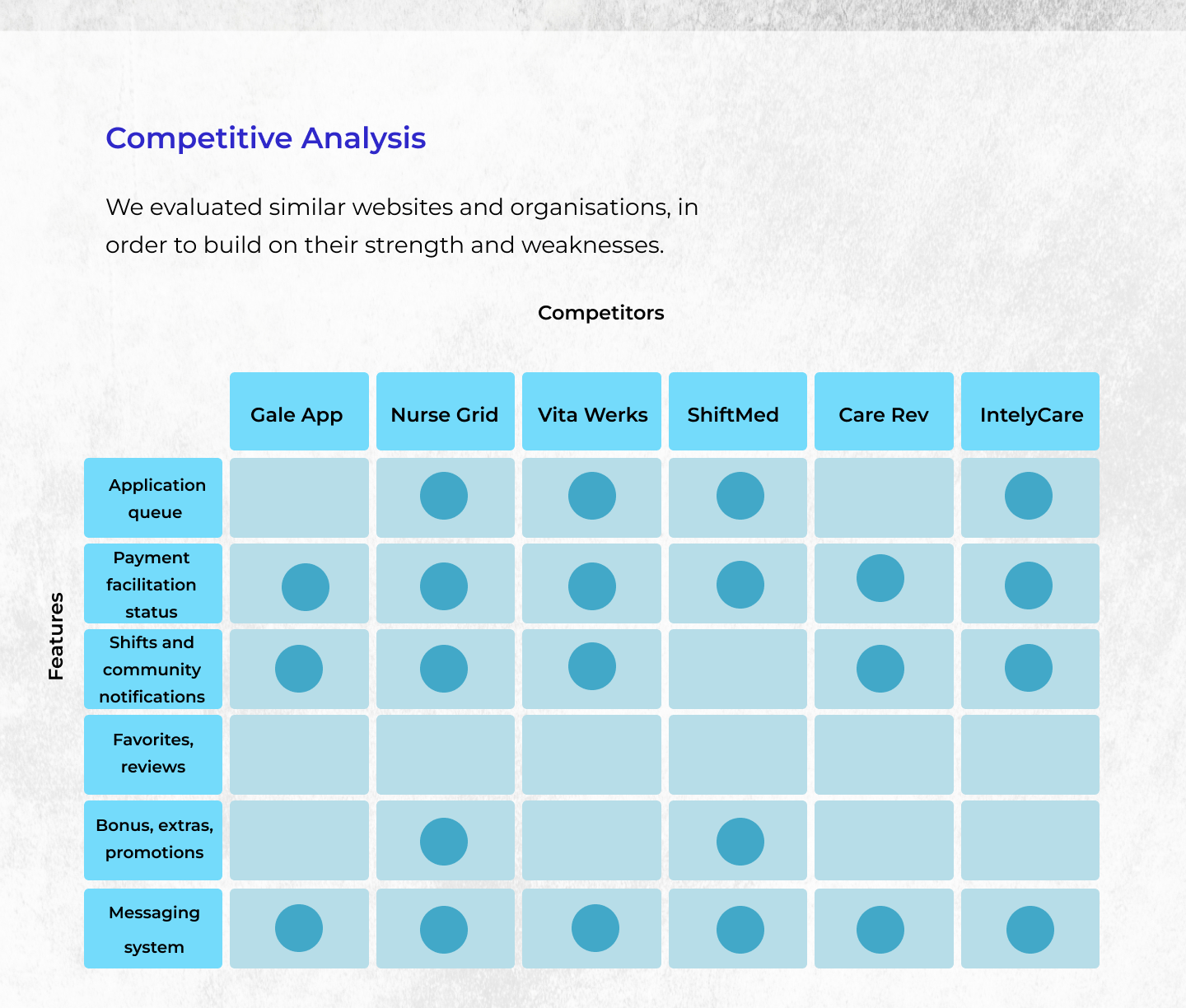
Research and competitive analysis.
A thorough competitive analysis was conducted to understand the strengths and weaknesses of similar apps in the market. User interviews with current and prospective users of Kare Heroes provided insights into their pain points and preferences. This research informed the redesign strategy, ensuring it addresses user needs effectively.
Research Details:
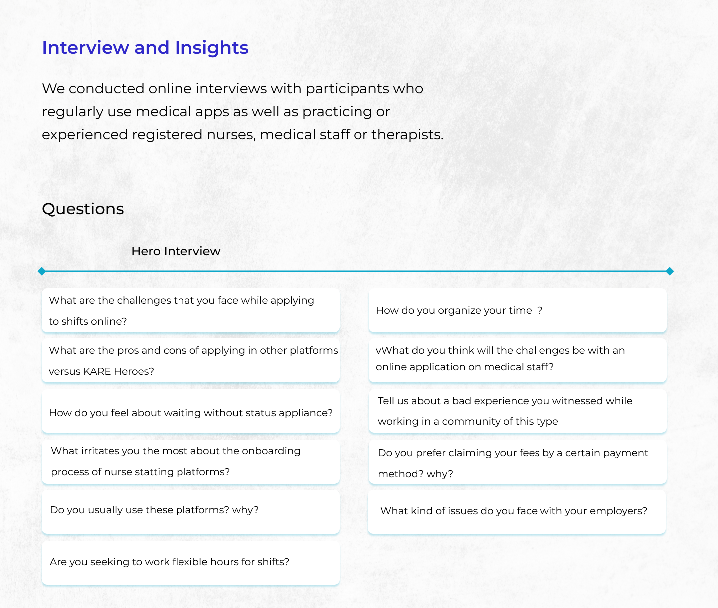
User research focuses on understanding user behaviour, needs and motivation through observation techniques, task analysis and other feedback methodology. We have followed two research methods i.e Qualitative and Quantitative Analysis.
In the quantitative analysis, we have taken a survey of 47 people this insight come up from social media groups.
In the qualitative analysis, we have taken the interview of 6 people who cares to understand the difficulty they face during applying to nurse staffing platforms.
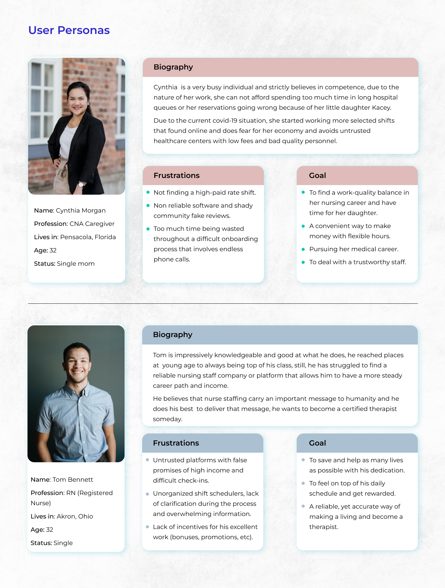
User Personas.
Personas were developed based on these interviews to represent the primary user groups and guide design decisions. Using insights from the interview, we gather some important points that will shape our app to give users the best experience.
To present the point of view of the users , I created two people from those I interviewed.
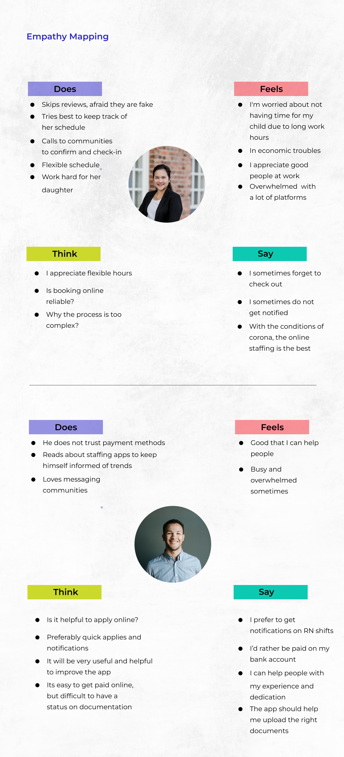
After the research and interviews, we also traced our affinity map to indicate the pain points and insights of the app and our competitors with the users.

Empathy Mapping & User Journey.
After the research and interviews, we also traced our affinity map to indicate the pain points and insights of the app and our competitors with the users.
And also, by analyzing information obtained from the survey, user personas and interviews, I moved to create the empathy map a customer journey map. The response of the users helped me create the ideal map and journey users will take to achieve their goals.

Hands-on Design.
The first step was to ideate the information architecture for the redesign of the app and of course, the possible best user flow to simplify the navigation for the user. See how we simplified the workflow by putting off unnecessary stuff like the amount of advertisement that was in the previous app, 5 main sections (bottom tab navigation against old menu, few clicks and pretty straight forward navigation.
Information Architecture.
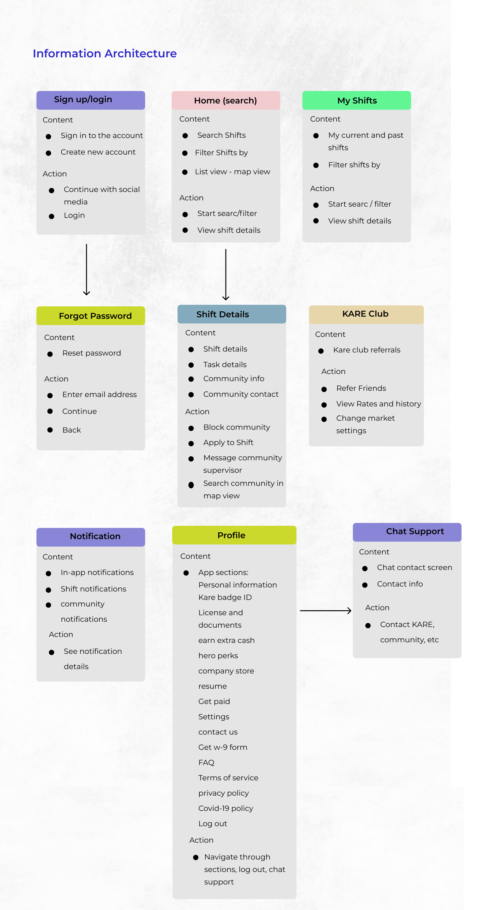
User Flow.

Wireframing.
Brainstorming Sessions
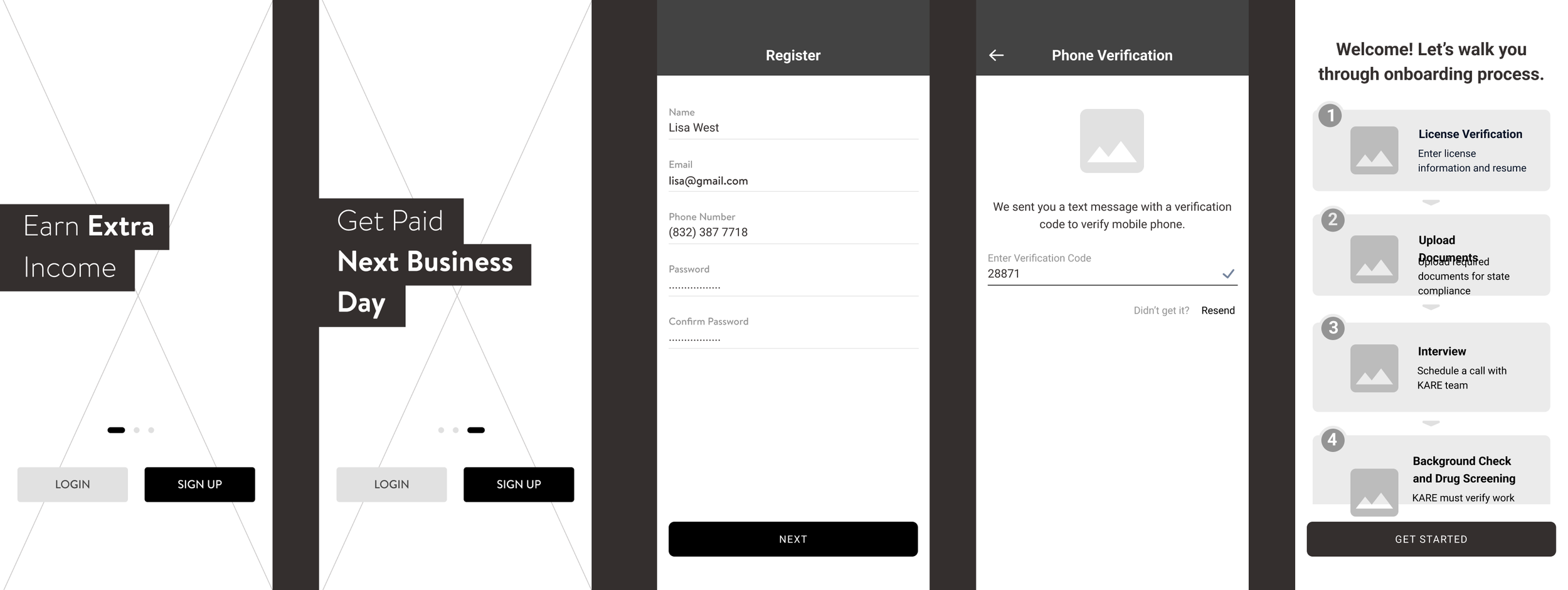
Several brainstorming sessions were held, involving initial ideas and layouts. These sessions helped visualize potential solutions and allowed for quick iteration and feedback from stakeholders. Wireframes were created to establish the basic layout and structure of the redesigned app. These wireframes served as a blueprint for the visual design, ensuring all necessary features and functionalities were incorporated.
Below are some examples of the sign-in and sign up process, share shifts, shift details, map area, my shifts and the check out page as well as a peak of the simplified onboarding process.


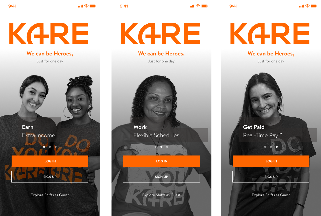
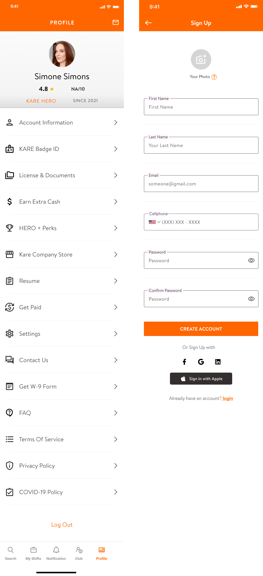
Mockups & Prototpying.
High-fidelity mockups and an interactive prototype were developed to bring the wireframes to life. These mockups used a clean, modern design language to enhance usability and aesthetic appeal. The prototype was used for user testing to gather feedback and make necessary adjustments.
Also, the design system (previously created by UI) was changed to be Material 3 design system (compatible with Flutter development framework used by the dev team inside the project) to build in the new components and visual style and features of the app, this was made with the purpose of giving it a much richer visual (but cleaner and more minimalistic approach) plus a better way to customize everything.

User Testing.
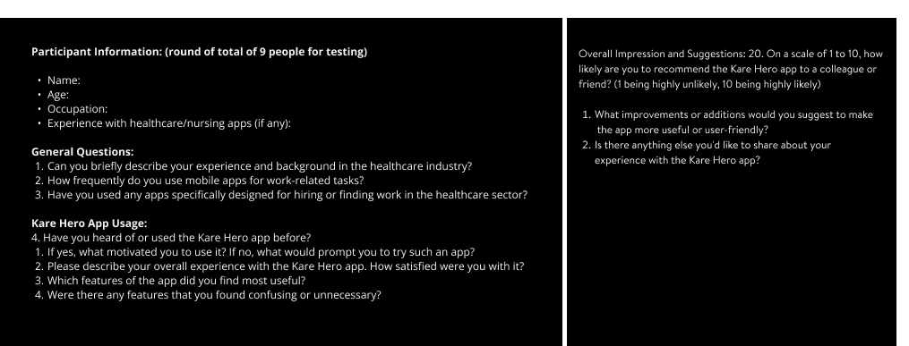
User testing was conducted to receive feedback after the high-fidelity mockups and prototype were handled to 9 different users and a script was elaborated for this purpose gathering some pretty good insights after the first launching of the app (in its BETA version). Below you will see part of the Usability Script I came up with for the users, as in general questions, KARE app usage, their personal data and the overall impression and what could be improved.
The exercise however consisted in asking them questions about some particular tasks they were asked to do regarding the different main core sections of the app: Shift search, My Shifts, KARE Club, Profile and Notification and their internal pages. Example, a user that was handed over the shift filters tasks was asked:
How easy was it to use the shift filters to find relevant job postings?
Did you encounter any difficulties in filtering shifts based on your preferences?
On the other hand the process of applying had questions such as:
Was the process of applying to shifts straightforward and efficient?
Did you encounter any issues while submitting your applications?
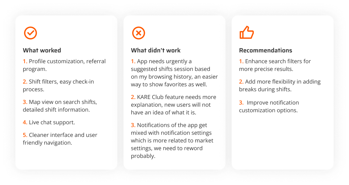
Final Results & Takeaways.
After the User Testing, we proceeded to work on those design tweaks and come up with the final worfklow.
Insights from Usability Testing:
Complex Onboarding Process: Users expressed frustration with the lengthy documentation required due to healthcare regulations in the USA. They desired a streamlined onboarding experience.
Need for Enhanced Filters: Users highlighted the importance of robust filtering options to refine shift searches effectively.
Confusion between Settings: Users struggled to differentiate between notification settings and market settings, indicating a need for clearer categorization.
Redesign Takeaways:
1. Streamlined Onboarding Process:
Introduced a guided onboarding wizard and stepper to simplify the documentation process.
Implemented progressive profiling to collect essential information gradually, reducing user fatigue.
Provided clear explanations for why certain documents were necessary, improving user understanding and compliance.
2. Enhanced Filters:
Expanded filter options based on user feedback to include parameters such as shift type, location, pay rate, and required certifications.
Incorporated predictive search functionality to suggest relevant filters as users type, enhancing usability and efficiency.
3. Clear Differentiation of Settings:
Segregated notification settings and market settings into distinct sections within the app's settings menu.
Utilized clear labels and icons to differentiate between the two, reducing user confusion and enhancing usability.
Results:
Improved User Engagement: The streamlined onboarding process led to a significant reduction in drop-off rates during registration, resulting in more users completing the onboarding journey.
Enhanced User Satisfaction: Users reported increased satisfaction with the redesigned filtering options, finding it easier to discover relevant shifts matching their preferences.
Reduced Confusion: Clear differentiation between notification and market settings reduced user confusion, leading to a more intuitive experience.
Increased User Adoption: With a 15% increase in user registrations during 2023, Kare Hero is on a trajectory towards becoming a highly regarded platform in the healthcare staffing industry.
Conclusion: The redesign of Kare Hero's onboarding and core sections successfully addressed user pain points identified through usability testing and user feedback. By prioritizing simplicity, clarity, and user-centric design principles, Kare Hero is positioned to deliver a fantastic user experience, driving continued growth and user adoption.
